
The stock page
Tap any row and you get the whole story of one position: price and day change, position value, gain/loss in dollars and percent, XIRR since the first buy, share balance, average cost, what you bought, what you sold, and every fee. Tabs beyond that carry dividends, company research and the full transaction history.
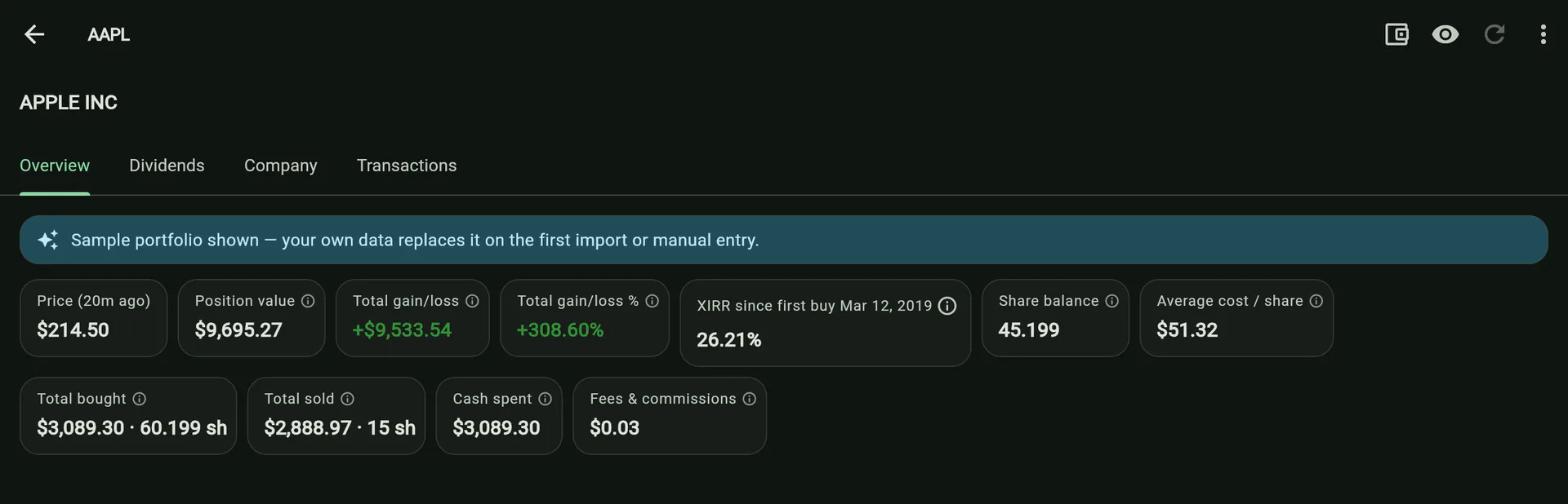
The stock page is where a holding stops being a row in a table. It is tabbed — Overview, Dividends, Company, Financials, Analysts, Transactions — and a tab appears only when it has something to show, so a certificate of deposit shows three where a fully-configured stock shows six.
Overview
The position, top to bottom: what it is worth, what it cost, what it has returned, and how. Then the analyst consensus if a source is configured, then the price chart.
The chart is drawn from cached daily closes and overlaid with your own trades as markers, at the price you paid. Prices are per share, so it stays visible even in privacy mode.
Every number carries its own explanation
A figure with no sense of scale cannot be read, and one with no caveat is how a beginner talks themselves into a value trap. So every metric on this page — not just the hard ones — has an ⓘ that opens a written explanation with the same four sections:
What it is · What counts as normal · Can you judge an investment by it · Where it misleads
The friendly-looking figures are the ones most often misused, which is exactly why they are all included: average cost invites holding a loser to break-even, a 52-week low invites confusing cheap with good, and a 9% dividend yield looks like the best card on the page when it is usually the worst.
Dividends
Total received, split into the part paid in cash and the part reinvested; yield on cost; a forward yield from the current declared rate; the next declared payment where the provider announces one. Two charts sit underneath — declared dividend per share over time, and what you actually received by year, summed from your own transactions.
Company, Financials and Analysts
Optional, credential-gated, and each renders nothing when it has no data: valuation and profitability ratios, a comparison against the company’s own sector or industry, its own valuation history, revenue and earnings by fiscal year, a discounted cash flow with a sensitivity grid, analyst estimates and rating spread, and insider transactions from Form 4 filings.
When all of them are empty, one note appears naming only the credentials you are actually missing — five silent sections and no explanation is a discovery failure, and five separate nags would be worse.
Transactions
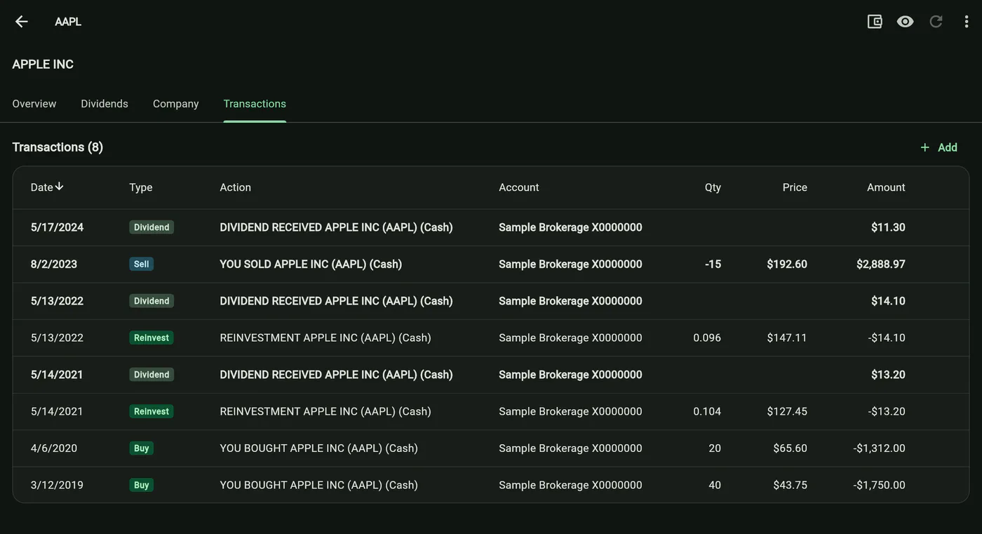
Every row for this symbol, with its type tagged. Taxable rows are bolded, ignored ones muted. Tapping a type tag re-tags that row — most usefully to Ignore, which neutralises a stray or erroneous statement line without deleting it, or to transfer, which is how you tell the app that shares arrived from somewhere else and their cost basis needs supplying separately.
Manual prices
A holding with no market quote — or one the API cannot price — can be given a price by hand. It is stored apart from the quote cache, so it is never overwritten by a refresh, and because every screen reads prices through one service it immediately drives every value, total and metric for that symbol. Which is precisely why Positions badges and counts the symbols carrying one.