
The overview
A health hero, a ranked issues list where every row jumps to the thing that is wrong, and cluster capacity gauges.
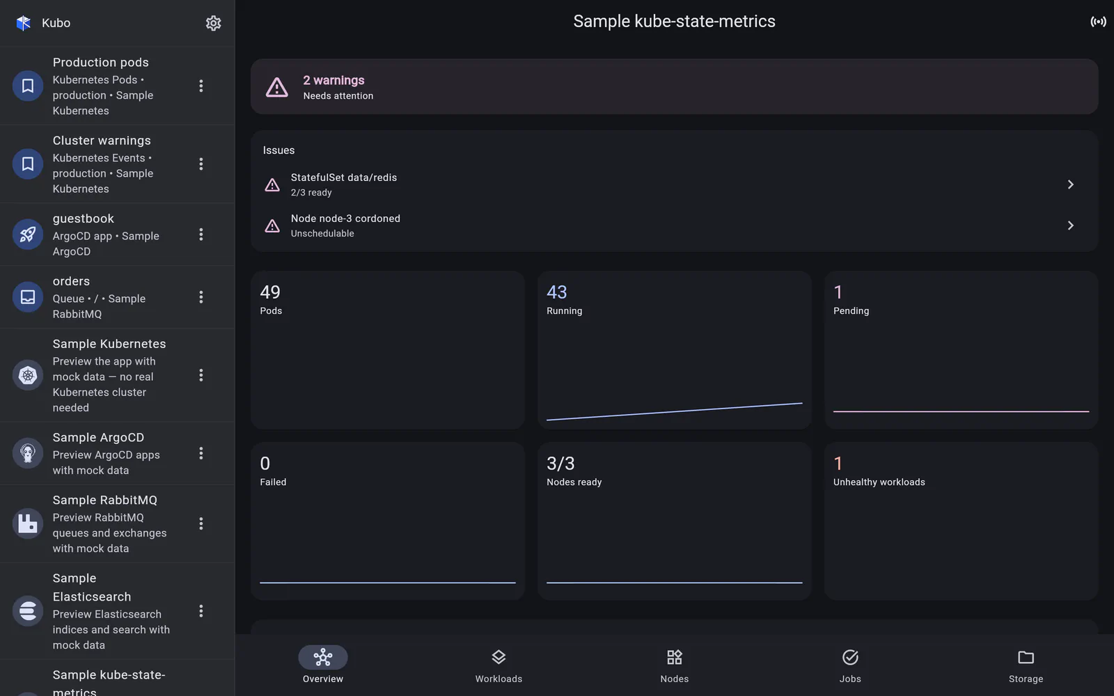
Most dashboards make you infer the answer from a wall of panels. This one leads with it.
The hero
A green / amber / red banner summarising cluster health, computed from the issues below it. On a phone, glanced at from a lock screen, that colour is often the whole interaction.
Ranked issues
Under the hero sits a list of what is actually wrong, ordered by severity, with every row tappable — it jumps to the section that explains it:
- crash-looping containers and failed pods;
- under-replicated workloads — fewer ready replicas than desired;
- nodes that are not ready, or cordoned;
- failed jobs;
- namespaces over their resource quota.
Each row names the object, so “3 pods crash-looping” is not the end of the sentence.
Capacity
Two gauges show cluster CPU and memory requested versus allocatable, built from
container resource requests (kube_pod_container_resource_requests) against node
allocatable (kube_node_status_allocatable). This is the number that explains why a
Pending pod cannot schedule, and it is not the same as usage — a cluster can be 95%
requested and 20% busy.
Trends
Stat cards carry sparklines, a donut breaks pods down by phase, and history charts sit below. Because KSM has no history endpoint, that history is accumulated in-app from each scrape (see access and polling) — counters such as container restarts are differentiated into per-second rates rather than plotted as ever-rising lines.
Back to kube-state-metrics.