
The activity heat map
Collections × operations, incremented live by the change stream, with colour tracking recency rather than totals.
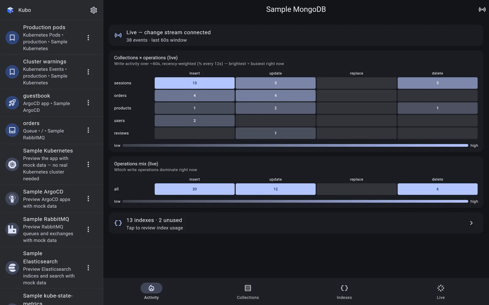
The Activity section is the at-a-glance dashboard, and its centrepiece is a heat map of collections × operations: rows are the busiest namespaces, columns are insert, update, replace and delete.
Colour is recency, not volume
Every change event carries an exponential recency decay — a weight that halves roughly every twelve seconds, over a window of about a minute. That decayed weight drives the cell’s colour, while the raw event count stays the readable label.
The result is a display that behaves the way you expect a live one to: a burst of writes lights a cell up, and it cools smoothly as the burst subsides, instead of staying bright because it was busy a minute ago. Collections are ranked by decayed weight too, so a namespace that is busy right now rises above one that was.
That separation — colour for “how recent”, number for “how much” — is why the grid is readable at a glance and still accurate when you look closely.
The rest of the section
- an operations-mix strip — which write operations dominate right now, across the whole database;
- an index-usage summary, with a tap through to Indexes.
The grid itself
The heat map is a shared component: a skinnable labelled grid with animated cells that brighten and cool, a per-cell tooltip, normalisation per column or across the whole matrix, and an optional second channel so colour and number can track different signals — which is exactly what the recency decay uses.
The sample MongoDB connection ships a mock
shopdatabase with evolving counters and a timer-driven synthetic change stream, so the heat map animates with no backend at all.
Back to MongoDB.