
History charts
Real broker-side history, drawn from sample arrays the Management API only returns if you ask for them properly.
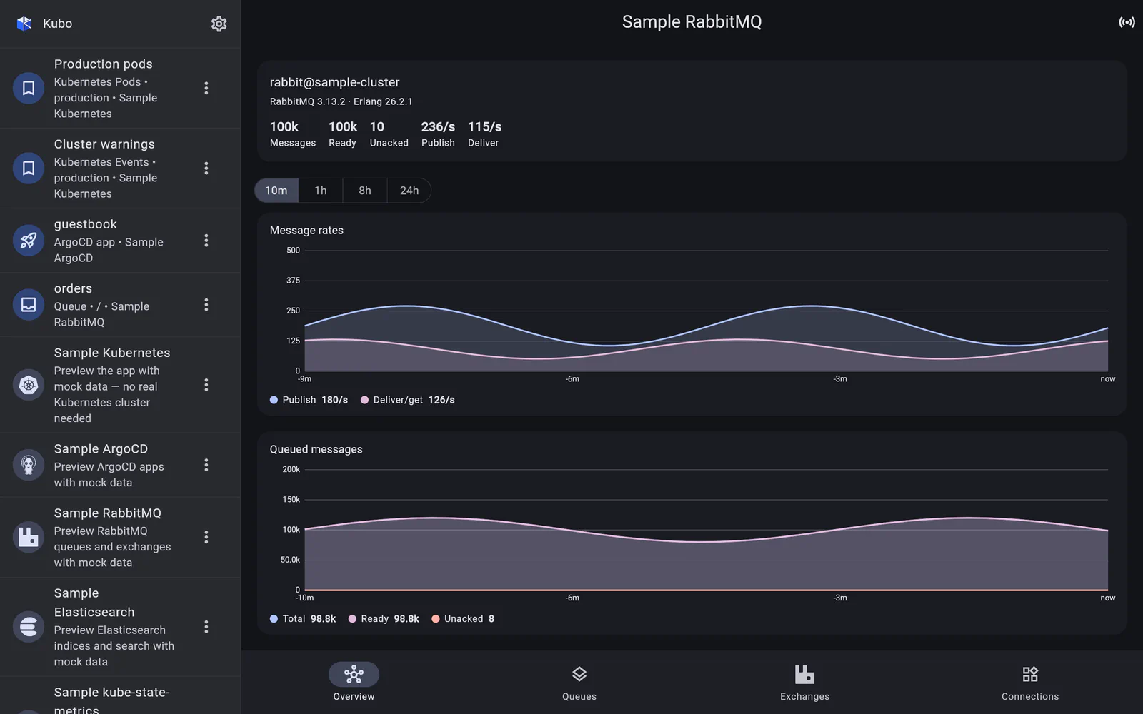
RabbitMQ’s own web UI draws its graphs client-side — there is no server-rendered chart image to borrow, and no “give me a time series” endpoint in the obvious sense.
What the Management API does expose is time-series samples embedded in each
*_details block — but only when the request includes the right parameters
(lengths_age/lengths_incr and msg_rates_age/msg_rates_incr). Ask for the overview
without them and you get instantaneous values; ask correctly and the broker hands back its
own history.
So Kubo asks correctly. A shared window picker (10 minutes / 1 hour / 8 hours / 24 hours) drives those parameters on the overview, queue and exchange requests; the samples are parsed into series; and a custom painter renders them — gridlines, axes, multiple series with a faint fill, and a touch crosshair with a value readout.
No charting dependency means the charts inherit the app’s active skin rather than importing a library’s palette.
Gauges and rates are treated differently
- Depth metrics (queue message counts,
queue_totals) are absolute gauges and are plotted directly. - Rate metrics come from cumulative counters in
message_stats, so they are differentiated into per-second rates before charting — otherwise every chart would be a line going up and to the right forever.
When a chart is empty, it says so
What the broker returns is bounded by its own sample_retention_policies. Ask for 24 hours
from a broker configured to keep ten minutes and you legitimately get nothing back — so the
card shows an empty state that says as much, rather than drawing a flat line at zero and
implying the traffic stopped.
Back to RabbitMQ.