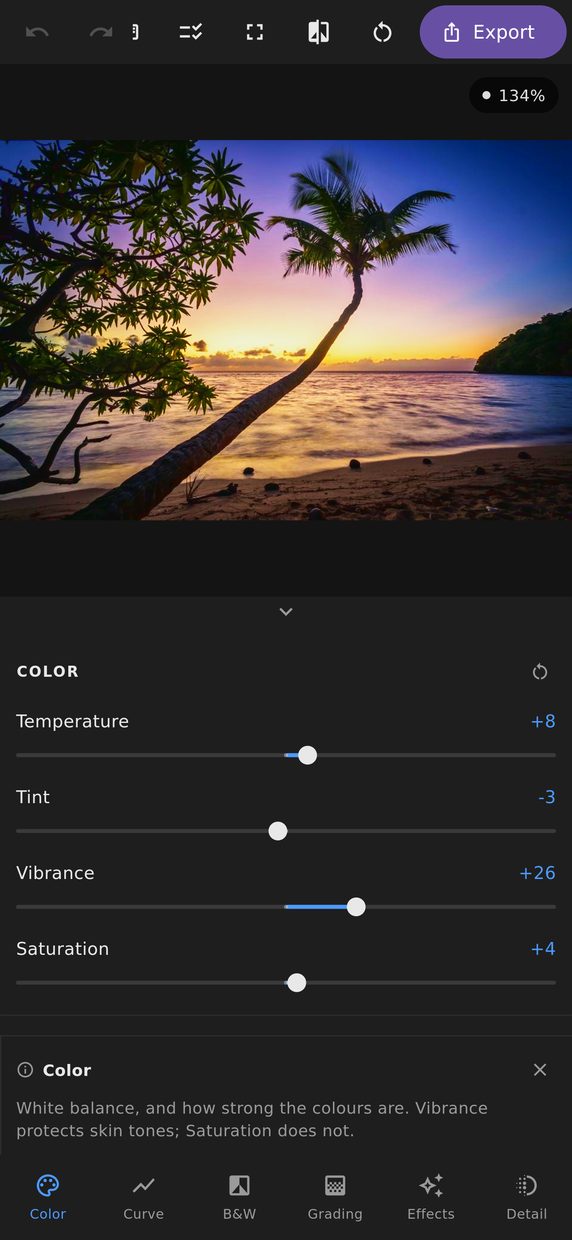
Every photograph is taken under a light with a colour, and almost none of those lights are neutral. Temperature and tint are how you tell the editor what the light was, so that the things which were grey come out grey.
Temperature and tint
Temperature runs blue to yellow, tint runs green to magenta. Between them they cover the two axes that real light actually varies along: time of day and sky conditions move the first, artificial lighting and foliage bounce move the second.
Both are worth reaching for before anything else in this panel. Vibrance and saturation decide how strong a colour is; temperature and tint decide which colour it is, and getting that wrong first makes every later adjustment fight it.
Vibrance versus saturation
Saturation multiplies every colour equally. Vibrance raises the colours that are already dull and leaves the ones that are already vivid mostly alone — and it protects the band that skin sits in.
The difference matters because the fastest way to ruin a photograph of a person is a saturation slider. Skin runs orange before anything else in the frame gets interesting, so a global multiply turns people orange while the landscape behind them is still flat. Vibrance is the version of that control you can actually use on a portrait.
Colour Mix
Eight bands — red, orange, yellow, green, aqua, blue, purple and magenta — each with its own hue, saturation and luminance.
This is what you reach for when the problem is one colour rather than the whole picture: foliage that is too yellow, a sky that is the right brightness but the wrong blue, a red jacket that is drawing the eye away from a face. Moving a band’s hue nudges those pixels toward a neighbouring colour; luminance changes how bright that colour renders without changing anything else in the frame.
The bands are deliberately broad and overlapping, so a colour that sits between two of them — and most real colours do — moves smoothly as you adjust either. There is no hard boundary in the frame where one band stops and the next begins.
On a wide screen
Give the window enough width and the Colour tool’s panels — this one, black and white, and colour grading — split across two columns instead of one long scroll, with the photograph still large. Width buys you more of the tool you chose, not more whitespace between its controls.