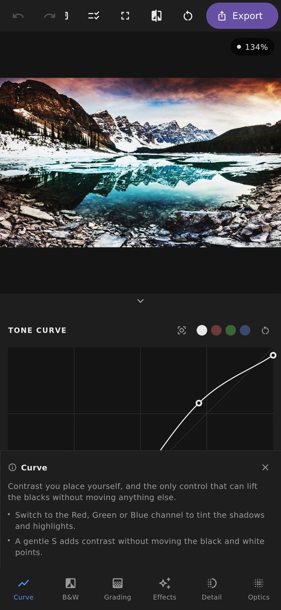
The tone curve is the most direct control in the editor. The horizontal axis is the tone that came in, the vertical axis is the tone that goes out, and you drag points to say what maps to what.
The S-curve
Pulling the shadows down slightly and the highlights up slightly produces the classic S, which adds contrast in the midtones — where the eye is most sensitive — while leaving the extremes alone. It is a more precise version of the contrast slider, and it is where most people end up once they discover it.
Inverting the S flattens a scene, which is how a faded, filmic look is made without dropping saturation.
Per-channel curves
The composite curve moves all three channels together. The red, green and blue curves move one each, and that is a colour tool rather than a tone tool.
Lifting the bottom of the blue curve puts blue into the shadows without touching anything else, which is the traditional recipe for a cold, cinematic night scene. Pulling the top of the blue curve down warms the highlights. Between them you have most of a colour grade before you have opened the grading panel.
Monotone cubic, and why it matters
Points are joined with monotone cubic interpolation. The important word is monotone: the curve is guaranteed never to overshoot between the points you placed.
A plain cubic spline through the same points can bulge above or below them, which in a tone curve means a range of input tones that come out darker as they get brighter. The visible result is a band or a reversal in a smooth gradient — a sky that goes light, then dark, then light again — from a curve that looked perfectly reasonable on screen. Monotone interpolation makes that impossible by construction.
Parametric regions
Alongside the draggable curve there are four region sliders — highlights, lights, darks and shadows — with movable split points between them. They are the same idea expressed as a control you can nudge without aiming at a point, which is a great deal easier on a phone.
Reading the curve
The histogram sits behind the curve, so you can see which part of it your photograph actually occupies. A steep section adds contrast to the tones underneath it; a flat section removes it. Everything the curve does follows from that one relationship, and having the histogram behind it means you are steepening the part of the range your picture is really using.