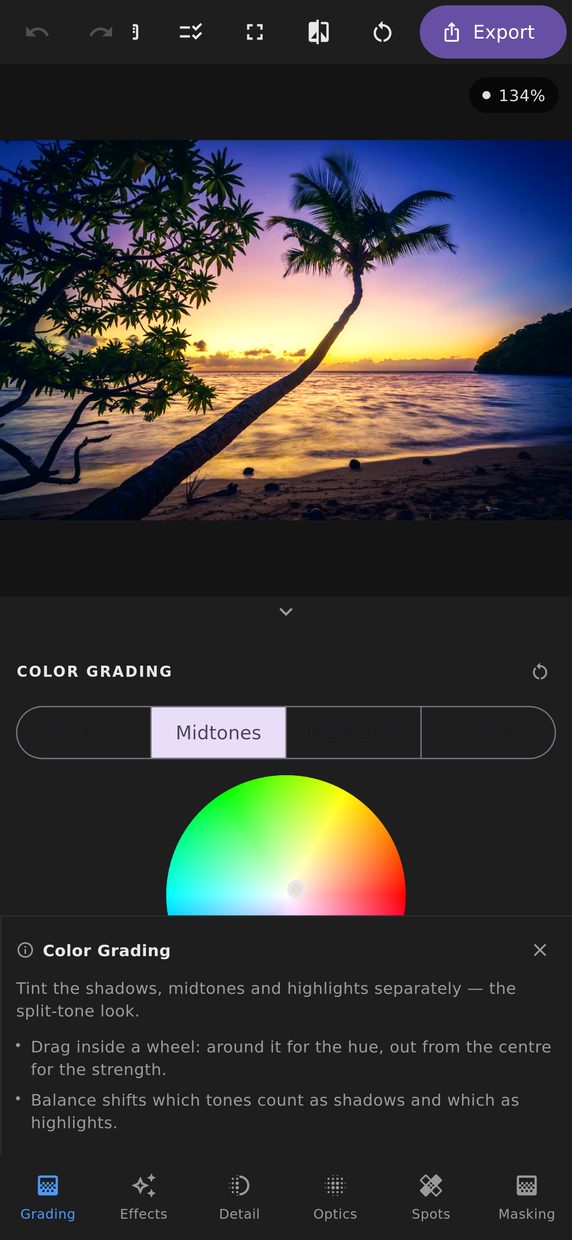
White balance is about removing a colour cast. Colour grading is about adding one on purpose, and the two are separate panels because they are opposite intentions.
Four wheels
Each wheel sets a hue, a saturation and a luminance, and applies them to one part of the tonal range:
- Shadows — the dark end.
- Midtones — the middle, where skin and most subjects live.
- Highlights — the bright end.
- Global — everything, applied on top of the other three.
Why cool shadows and warm highlights
Because it is what the eye already believes. Sunlight is warm and the shadows it leaves are lit by the blue sky above them, so a scene with warm highlights and cool shadows reads as daylight before you have consciously registered the colour at all. It is the oldest trick in colour grading and it is still the most reliable.
Reversing it — warm shadows, cool highlights — reads as tungsten light in a cold room, which is its own strong and much more specific mood.
Blending and balance
Balance moves the boundary between what counts as a shadow and what counts as a highlight. Push it up and more of the frame is treated as highlight, so the highlight wheel does more of the work.
Blending controls how sharply the three ranges hand over to each other. Low blending keeps each wheel’s influence tightly in its own range, which is what you want for a strong, obvious split tone. High blending lets them overlap into a single smooth wash.
Grading versus a per-channel curve
Both can put blue in the shadows. The difference is how you aim: a curve gives you exact control over which input tone becomes which output value, and the wheels give you a hue and a strength in the terms you actually think in. Most edits use both — the curve for the tonal shape, the wheels for the colour laid over it.
Keep the saturation low. A grade that is obvious in isolation is usually too strong in a set; the ones that hold up are the ones you notice only when you switch them off.