One app, every screen
A multi-pane layout on desktop and web, and a bottom-tab layout on phones — Request · Response · Library · Servers. The same app in both; only the arrangement changes.
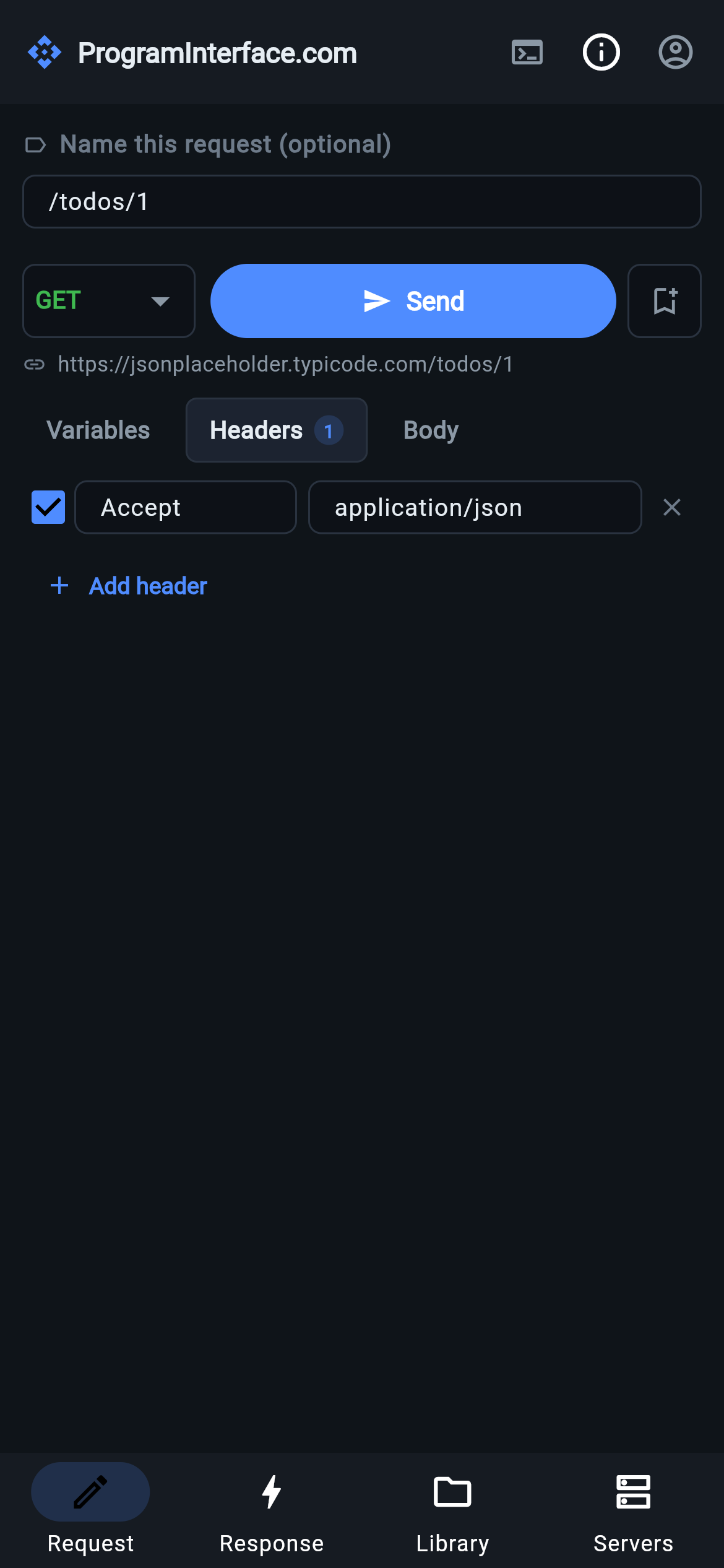
The phone layout. Sending jumps to Response; replaying from the Library jumps back to Request.
ProgramInterface.com is one app on macOS, Windows, Linux, iOS, Android and the web. That’s not a checkbox — it’s why the API you were debugging at your desk is the API you can poke at from a phone on the way home.
Desktop and web
On a wide window you get the multi-pane layout: a sidebar holding the active server and the history / collections list, with the request builder above the response panel in the main area. Everything is on screen at once, which is what a wide window is for.
Phones
On a narrow one, the same four surfaces become bottom tabs — Request · Response · History · Servers. Each gets the full width of the screen instead of a cramped quarter of it.
The navigation follows what you’re doing rather than making you drive it:
- Sending switches you to Response, because that’s what you wanted to see.
- Replaying from the Library switches you to Request, because the next thing you’ll do is edit it.
The same app, rearranged
There is no separate mobile app and no cut-down mobile feature set. The request editor, response panel, history panel and server bar are the same in both layouts; only their arrangement changes, chosen on window width. A feature arrives everywhere at once and behaves identically wherever you meet it.
The one platform difference worth knowing is interactive user login, which needs to catch a redirect on your own machine and so is unavailable in the browser. Everything else — including client-credentials OIDC and static bearer tokens — works everywhere.